Oxygen Refresh
Oxygen brought us on to expand the network’s graphic look into bold, new terrain, a sparkling refresh of a brand that champions women to be themselves and encourages them to dive into life.
Like a musical DJ, we got to do a remix on a brand we loved, slicing and dicing some of its deepest cuts into something fresh and new.
In the original Oxygen brand, the most important device was the logo’s “connector,” an underscore beneath the “O” that unites copy and graphics in cool and creative ways across the package. We added a lot of potential to this flexible little bar by incorporating two other parts from the logo into the toolbox: the “O” itself and the circle inside it.
This let us design patterns with the brand’s familiar shapes that move and dance, inviting the viewer in with rhythms and sequences that are hard to resist. Mixed together in our new package, they take on a dazzling uniqueness that is completely ownable to Oxygen, and to Oxygen alone.
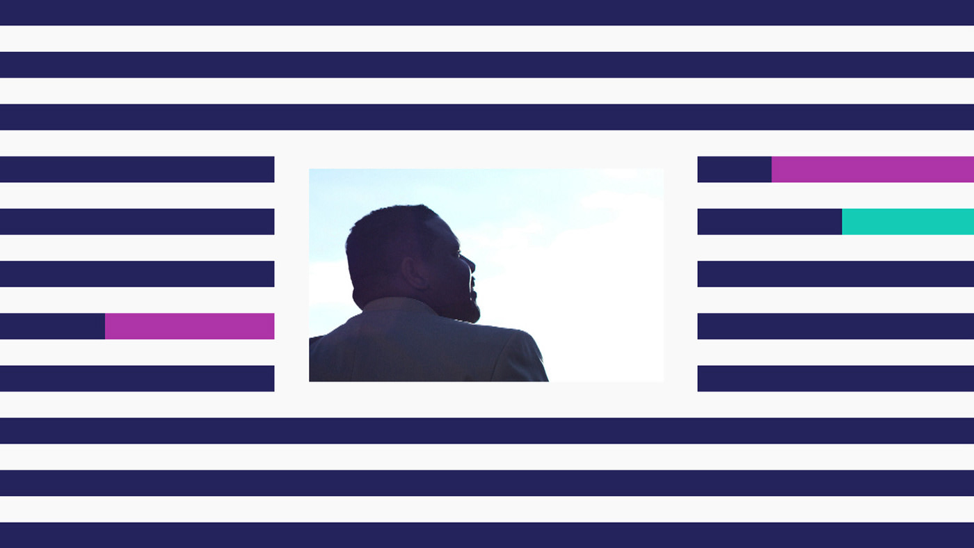